Tuesday, December 29, 2009

New book finished!

Hello again!
I just finished the art on a great new mini written by my friend Matthew Smith, which can be found here: http://www.mdsmithcomics.blogspot.com/. We exhibited next to each other at SPX this past fall, and realized a wonderful truth: he likes to write comics, and I like to draw them. And voila, so began the project of "Suggestion Box #2, 3, 4...."! Here is the cover of the first one, called "Hip-Hop Hooray:

The story is all 100% true based on Matthew's experience working in a record store, which I do not envy him one bit. Here's a sample of one page of the book:

I'm really pleased with how it turned out! I tried to place this comic within the 1990's, when, while it may not have taken place then, is still a great place to put it: Nine Inch Nails and Michael Jordan shirts, Eminem haircuts, and the rest. If you have any interest in picking one up (numbers are super limited), please email me at katie.omberg@gmail.com for pricing and availability.

Til next time!

Sunday, December 20, 2009

Comic books!

Hello hello!

So I finally was able to borrow my roommate's camera so that I could take some photographs of my comic books. I left my job where I had access to a scanner and CS4, which is why it's been so long since I've updated. Hopefully, I will not loose access to this camera anytime soon!

About four years ago, I took a semester off of school and went to SPX, which is something super awesome that everyone should know about. Here's a link: http://www.spxpo.com/. It has yet to be updated for 2010, but it should be updated in February or so. SPX is an expo for independent and self-published cartoonists. It's a great opportunity for those who (like me) just love to draw, and want a forum to get their name and their ideas out there. There are a lot of people who run off their books at Kinkos, and are just there to share their comics. There are also a number of smaller publishers there, like Top Shelf and Drawn and Quarterly.

Here is the cover of the book that I sold there, called "Suggestion Box:"


I used to work in a frame store, which is where the story in this book came from. It was in the suburbs of DC, and was full of stay-at-home moms with too much time and too much money on their hands. There were a lot of cool people who came in, too, but also a lot of high-maintenance people. I tried to balance the book between the story of one customer who was pretty ridic, and the joys of working in a frame store. Here is the first page of the book:


This type of stream-line thought has shown up in more of my books since. The book I did for SPX this year was made mostly of this streamlined lay out, without boxes for seperate thoughts or ideas, but showing it more as they flow from one to the other. I also like how the full body portrait is of me in Cons. There are the only type of shoe I can draw in any recognizable form, even now. Everyone basically wears those, or just some type of dinner-roll shaped shoe.

When it came to the actual framing of pieces, here is a spread I did of how to back a picture. I didn't use any words; I figured it would take up too much space and take a lot of attention away from the rote action.


Ok, that's it for now. Some images of one of my later books to come!

Monday, November 30, 2009

Work in Progress: Editing a drawing to be published

This post is to talk a little bit about how I work on a comic strip, and also how much Photoshop is your best friend when you're preparing a comic to be published, or even to self-publish a book.

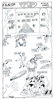
Here is a sample of a strip I did in my senior year of college. Here it is finished:

When I start work on a project, I always draw out a pencil version first, where I can work out how the lay out is, the dimensions, the wording, etc. Since it's in pencil, I can always erase and rework an image (or, more often, a facial expression) until I like it. I don't have a picture of this strip when it was just in the pencil state, but here it is with the underlying pencil and the ink on top of it:
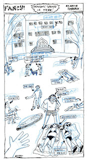
Usually I do the pencil with just a regular pencil, but I did this one with a blue pencil. I had heard that using a blue pencil for the under drawing is the easiest to erase and the hardest to come through on a Xerox. However, this wasn't really the case. It ended up being really hard to clean-up, since the regular change in contrast that I can do with a regular pencil on Photoshop didn't come through. I had to go in and minimize the cyan level in the CMYK settings, which got me this image:
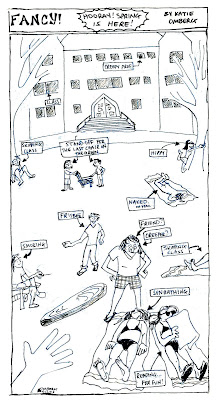
You can see that the image is still pretty junky, even though all of the blue is gone. I then had to go into the levels and adjust the magenta, since there was some of this left over; it must have been that the pencil I used wasn't completly cyan but had some magenta in it. At this point, what I had to do was go through with the eraser tool on Photoshop and erase out all the extra sketch marks. Let me tell you it was super boring and a real pain in the ass. BUT, finally, it was finished and was really to be published in the paper. Woot! Here's how the finished product looked again:
So you can see that it came a long way from how it began. Photoshop really is a big help; it's so nice to be able to draw the ink directly on top of the pencil sketch. I recently got a light table form my old job and have been using it for my drawings. If you have access to a light table, I would highly recommend using it! This is even better and makes life a lot better if you don't have access to Photohsop or a similar program that can edit photographs and drawings. With a light box, you can draw out a pencil drawing as you usually do, and can then draw with ink on a new piece of paper over it.

Monday, November 16, 2009

Here's a picture, for practice uploading images (yes, I am that clueless when it comes to the internets).

Yesterday was a beautiful day in the District, so my roommate and I went down into Rock Creek Park. He studied Arabic and I drew. It was awesome. Usually my drawings aren't this sketchy, but sometimes this sort of practice can be fun. Also, I will avoid drawing trees like the plague, but it was made more forgivable by creating a whole compoistion out of it, instead of just drawing boring boring trees the whole time.

I'm not sure what it is about trees that are so freaking boring for me. I think it's just that there aren't enough straight lines to make it interesting and their perspective is hard to get across. Two-point perspective is such a fun thing to work with -- it's so simple once you have done it once you can do it again time and time again -- but it is so hard to figure out how to make some branches going forward, some going sideways, and others going back into the distance.

Show time!

Hello everyone!

I have been holding off on starting a blog for a longer time then I meant to. I am a self-published comic books artist based in Washington, DC. I am creating this blog to keep people up to date with my current projects, and will slowly (but surely!) creating an archive of older work of mine, which will include a number of works from my college strip, "Fancy!" which was published in the Mount Holyoke College newspaper, "The Mount Holyoke News." I was the cartoonist and graphics editor there for three years.

Stay tuned for some updated strips and images from my current project with Matthew, and I hope to hear from you soon!